Overview
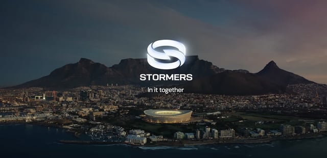
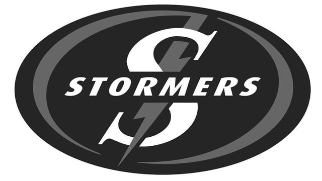
- The Stormers officially unveiled their revamped visual identity and logo on August 13, replacing a 25-year-old design.
- CEO Johan le Roux described the update as overdue and said the new symbol reflects unity among the franchise’s diverse supporter communities.
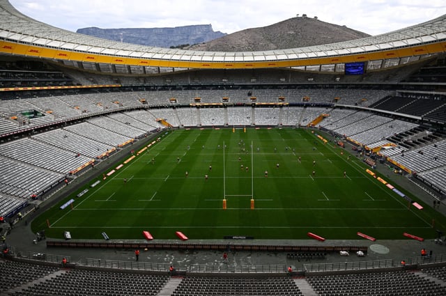
- The logo’s interlocking blue-and-white hoops, subtle lightning motif and stadium-inspired outline pay homage to the team’s heritage and home ground.
- Director of Rugby John Dobson said the rebrand aligns with the mission to make Cape Town smile and elevates the Stormers beyond a traditional rugby side.
- Leadership expects the refreshed brand to help position the franchise as a premier sports-entertainment entity that fans at every level can embrace.