Overview
- OpenAI introduced a redesigned 'blossom' logo with refined geometry and a larger central space, maintaining its recognizable structure while adding a more polished look.
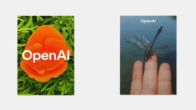
- The company launched a custom typeface called OpenAI Sans, blending geometric precision with softer, human-like elements to counter robotic aesthetics.
- The rebrand was led by OpenAI's in-house design team, collaborating with Berlin-based ABC Dinamo and Studio Dumbar for typography and motion design, respectively.
- The updated visual identity reflects OpenAI's evolution from a research lab to a global tech leader, emphasizing a balance between technological sophistication and a more organic, human feel.
- AI tools like ChatGPT and DALL·E were used minimally in the design process, primarily for technical calculations, as the team prioritized human creativity and expertise.