
Overview
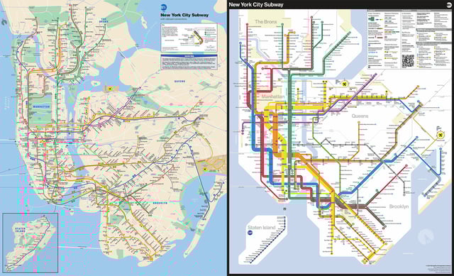
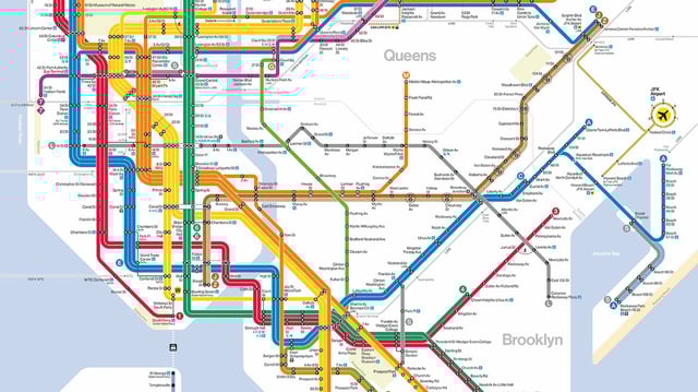
- The redesigned map, unveiled on April 2, 2025, features bright colors, bold lines, and a simplified layout to enhance legibility and navigation.
- It incorporates rider feedback, highlights accessible stations, and introduces clearer visual cues for transfer hubs and airport connections.
- The map blends design elements from the minimalist 1972 Vignelli map and the geographically focused 1979 Tauranac map, aiming for both clarity and functionality.
- Critics have raised concerns about geographic distortion and complexity, with some riders finding the new layout harder to interpret.
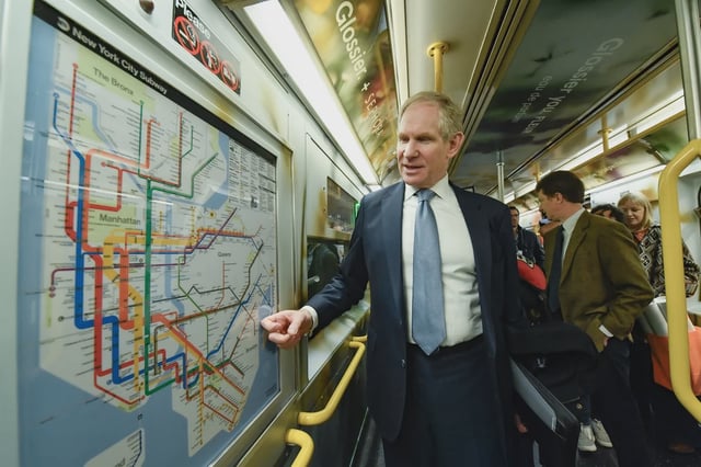
- The old map remains available online, and the new design will be installed across subway cars and stations in the coming weeks.