Overview
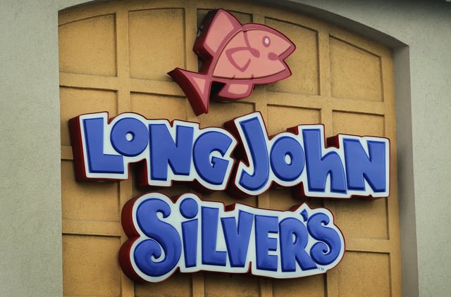
- The new chicken icon and “Chicken + Seafood” wording are already live on the company’s website and social pages.
- Executives say the update highlights a long-running chicken lineup, with seafood remaining a core part of the menu.
- Kentucky tests of chicken wraps and Nashville Hot Chicken and Seafood drew reportedly strong feedback, with no national rollout confirmed.
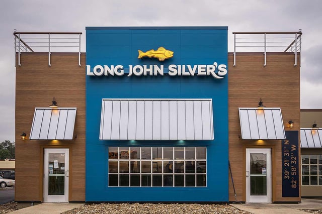
- The company has not said whether the logo change is permanent or whether existing restaurant signage will be updated.
- Coverage places the move within broader rebranding efforts across chains, noting Cracker Barrel recently reversed a logo refresh after criticism.