
Overview
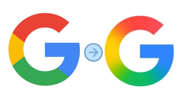
- Google has updated its 'G' logo for the first time since 2015, replacing the solid color blocks with a smooth gradient blending red, yellow, green, and blue hues.
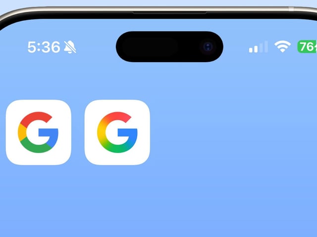
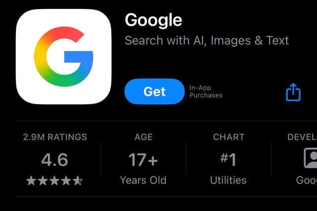
- The updated logo is currently visible on the Google Search app for iOS and Android beta (v16.18), but has not yet appeared on web platforms or other Google apps.
- This design shift reflects Google's broader alignment with its AI-focused branding, including the gradient aesthetics seen in its Gemini AI assistant and YouTube UI.
- The rollout has been phased and unannounced, with no formal comment from Google on the redesign's scope or whether it will extend to other products.
- The change retains the familiar shape of the 'G' while modernizing its appearance to better suit evolving digital interfaces and Google's AI-driven ecosystem.