

Overview
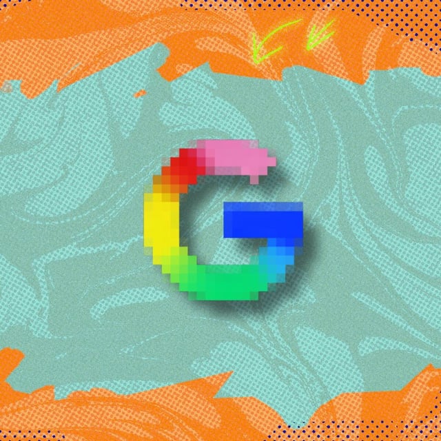
- Google announced the blended, brighter “G” on September 29 and confirmed it will replace the partitioned icon across the company.
- The new mark is already live in Search, the Google app, Google Home on iOS, and select web favicons.
- A phased rollout will extend the gradient look to apps such as Gmail, Photos, Drive, Meet, and Calendar over the coming months.
- The refresh keeps the four signature colors but blends them in a gradient, marking Google’s first major logo change in about a decade.
- The wordmark remains unchanged, with the update focused on the standalone “G” and consistent with the Gemini “spark” aesthetic.