Overview
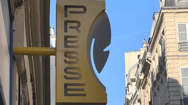
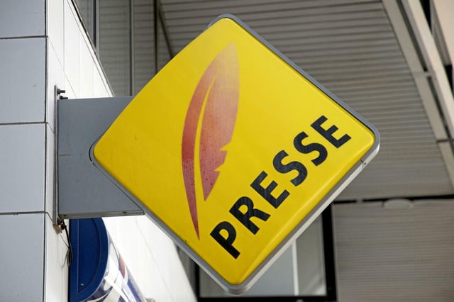
- The Ministry of Culture has replaced the decades-old red plume on a yellow diamond logo with a gray plume on a vertical yellow rectangle, designed by a team of young artists.
- The redesign aims to present a more modern and eco-friendly image, with materials meeting environmental standards and improved compatibility with other commercial signage.
- Critics, including politicians and social media users, have labeled the new logo as unattractive, ineffective, and a waste of public funds during a time of industry struggles.
- The French government is subsidizing up to 90% of the new logo's cost for newsstands in rural areas and 80% in urban areas as part of a modernization fund to support the declining sector.
- The number of French newsstands has dropped by 35% over the past 20 years, prompting the government to emphasize the logo's role in adapting to evolving consumer habits and sustaining accessibility to information.