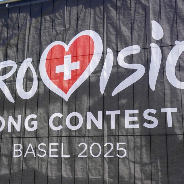
Overview
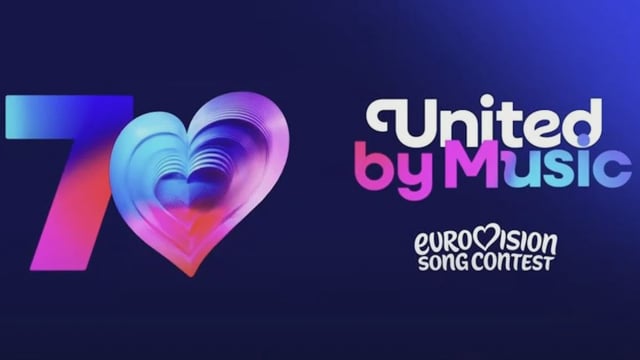
- The 70th‑anniversary update introduces a custom "Singing Sans" wordmark while retaining the signature heart.
- The visual system makes the heart a core element that can serve as the zero in "70" using 70 layers, places "Song Contest" beneath "Eurovision" for a stamp-like lockup, and keeps the "United by Music" motto.
- ESC director Martin Green described the identity as "bold, playful and full of heart" and said it honors the contest’s history while positioning it for the future.
- Coverage reported the Instagram rollout drew largely negative reactions from fans, including claims the design looks childish or AI-generated.
- FOCUS online said at least 95% of comments on the post were negative and noted more than 27,500 likes on the announcement, while Merkur.de reported a change.org petition calling for a return to the old logo.