Overview
- Apple released the first developer beta of its Liquid Glass design across iOS 26, iPadOS 26, macOS 26, watchOS 26, visionOS 26 and tvOS 26 following its WWDC 25 debut.
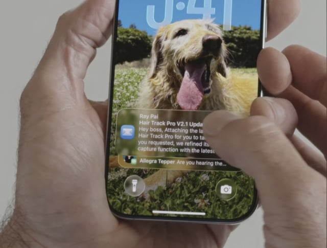
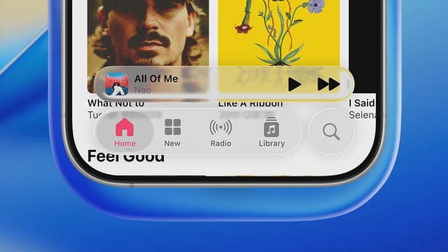
- Early testers report that translucent notifications and the redesigned Control Center overlay often reduce text legibility depending on wallpaper brightness.
- Apple addressed battery life concerns by citing recent advances in its hardware, silicon and graphics technology that support the new interface without significant power drain.
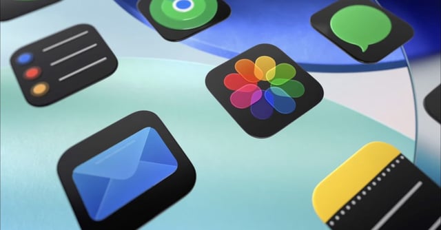
- Subtle touches such as glassy icon styling and morphing button animations signal areas where Liquid Glass may be polished before the public beta arrives in July.
- Some designers and tech leaders, including Nothing CEO Carl Pei, have praised the aesthetic potential of the new system despite its current usability challenges.


